
Jim Shaw - 'Graphic Designer'
Drawings, Posters, Covers, Forms, Graphics and Logos
Introduction
My father was always fond of drawing. In his first year at Boroughmuir Secondary School he was awarded First Prize for drawing and the following year Joint Second Prize. At times he would draw with a definite purpose in mind, but often he would just try out ideas for his own amusement.
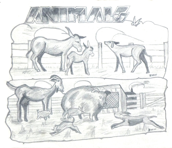
Pencil sketches on cartridge paper, (185mm x 150mm). Probable an early school project, perhaps a front cover for a picture book for young children or a copy of a favourite childhood book? The animals are rather stylised which is perhaps surprising given that my father would have frequently visited his grandfather's farm and seen real examples close up.
Customers
As an amateur my father had no formal ‘customers’, (arguably the exception being his formal school work!). Primarily he worked to please himself but over the years he freely worked to the benefit of the RAF, St. Ninian’s Presbyterian Church, Solihull, Birmingham 298th Scout Group and the Rover Company.
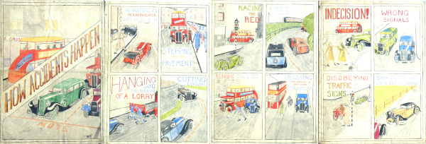
Water colours on drawing paper, (275mm x 375mm). Large four-page road safety booklet, almost certainly produced at school. It illustrated twelve hazards that might be encountred on the road, prams left on an incline, stepping off the pavement, hanging onto a lorry, cutting corners, racing the red, overtaking on bends, running after a ball, stepping out behind a stationary tram, indecision, wrong signals, disobeying traffic signs and braking too hard. Along with drawings of the many styles of cars of the period there are buses of the General Omnibus Company with external stairs and a train in Caledonian Railway livery.
School Years
Obviously during his school years he would have been required to draw and paint various subjects but it is equally clear that he must have made some illustrations for his own amusement, in particular painting or drawing various motor cars of the time. Some of his illustrations show cars from above rather than from the viewpoint of a pedestrian or buyer. I wonder if this is because he lived in an upstairs tenement, (flat or apartment) at the time? During these years he tried his hand at pencil sketches, posters, black ink sketches, calligraphy and example covers for booklets.
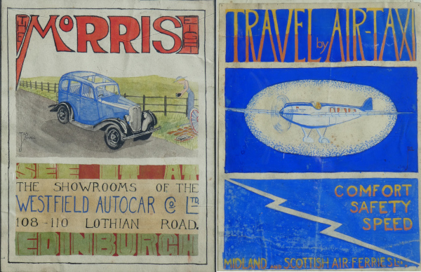
Water colours on drawing paper, (185mm x 245mm & 275mm x 375mm). These two posters were most likely painted at school around 1934. The Morris 8 car was announced in the autumn of 1933, Westfield Autocars was the local Morris dealer, their showroom premises are now a sports shop specialising in running. Midland and Scottish Air Ferries was a short-lived company, based in Scotland, that operated from 1933 to 1934. Perhaps the news of this company being launched excited some speculation as to what their future fleet would look like? The company doesn't appear to have ever used an aircraft of this type which is unusual in being a 'modern' monoplane with an enclosed cabin for passengers yet retaining an open cockpit such as was used with earlier biplanes.
Apprenticeship, College and RAF service.
During these years he experimented with draft posters relating to the garage that he worked at. Techniques included stencilling and linocuts. The first evidence of his designing forms date to his wartime RAF service in Belgium. The purpose of the form isn’t just to collect data but to present it in an easily understandable form too, something that isn’t commonly done even today.
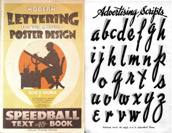
Paperback book (155mm x 355mm). The essential paperback text book for graphic designers, giving good and bad examples of layouts and many pages of various fonts with advice as to kerning. Whenever my father wanted to design a poster he would turn to this book to source a suitable font and no doubt ideas as to layout. The cover of his copy has long been lost but the 1938 cover shown here matches my memory, as do the almost complete set of remaining pages. Probably bought or given to him while he was in his final year of school. When 'Letraset' became available there wasn't the same need to search and copy from suitable examples of lettering and this book wasn't referred to as much.
Post-Marriage
After his marriage my father started a family and soon after took up a new job with the Rover Company which continued for the rest of his working life. At work he was continually drawing sketches to explain his ideas. Joining a new church he became an elder and the treasurer which lead to designing magazine covers and forms to assist in church management. My father took up scouting again, having been a scout as a boy. He took on the role of treasurer, fund raising and the design of fête programmes, for him, naturally followed.

Black pen on drawing paper, (125mm x 185mm & 110mm x 155mm), probable drawn around 1940 as an experiment in minimalist poster form. The French poster suggests that the Spitfire aircraft overhead is a guest until victory has been achieved and the swords are dry.
Production Techniques
The graphical work that my father produced for the church and the scouts was greatly influenced by the techniques available for reproducing the work in quantity at the time.
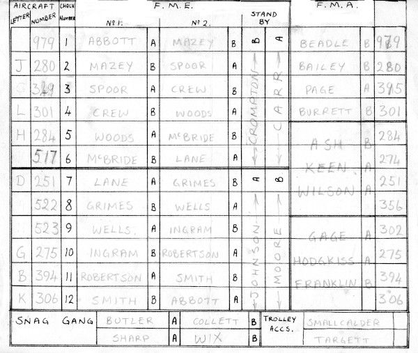
Paper with hand-drawn black pen, (250mm x 200mm). This form details the various tasks required to handle a Mosquito aircraft of 140 Squadron RAF on the ground and the Flight Mechanics Engines (FME) and Flight Mechanics Airframes (FMA) that have been allocated to perform them. The aircraft serial numbers date this particular example to between August and September 1944. It is most likely that this was an unofficial form designed to help my father, serving as a corporal at the time, to organise the ground crew under his direction.
Early poster work for the church was carried out by hand as perhaps only half-a-dozen or so, in a couple of sizes would be neded. Nevertheless it was desirable that the posters look the same so my dad made solid grounds by cutting out paper shapes to a template, used some stencil work using a mouth-blown spray diffuser and coloured inks, with the larger characters hand-painted with poster paints. Before embarking on any project involving text my dad would consult his paperback copy of the Speedball Text Book to find a suitable font that he would copy from.
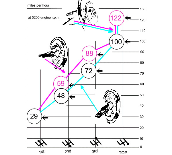
Re-drawn from original multi-pass duplcator production, (125mm x 205mm). [The original suffers from severe 'bleeding' from the reverse side]. An illustration from the operating handbook for a patented overdrive control system. It combines a graph showing the speeds available for the various gears along with graphics of the controls that the driver would need to use to obtain them. Conventionally a handbook would list the controls, provide an illustration of where they were situated then, at a later point in the text, describe how and when to use them. This graphic largely does the same in a single, simple illustration.
To help in his work as treasurer Dad used 'John Bull' printing sets that came with rubber type that could be set into grooved wood blocks using a pair of tweezers to make up stamps. He went on to develop a system of using pieces of perspex sheet to which foam rubber was glued. The rubber type required was glued, in turn, to the foam rubber. The perspex was backed with a piece of paper showing a print from the stamp. These stamps could sit on a desk and be used as required. He then produced a form to replace the odd bits of paper coming to him as treasurer following each church service. This too was made with characters from the 'John Bull' sets and was used to hand print forms in quantity until Xerox photocopying became the norm.
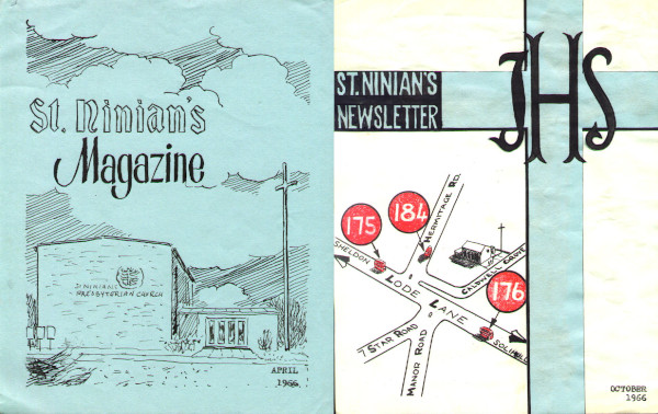
Coloured paper, (165mm x 205mm) Church magazine from 1966. Hand-drawn and reproduced by offset lithography. The artwork for the magazine remained the same over several years, just the date being changed. The colour of the paper was changed each month to alert church members that a new issue had been produced. The illustration was of St. Ninian's, the first permanent church premises of the Presbyterian Church in Solihull, later to become part of the United Reformed Church. The church has now been demolished and replaced by cathedral of the Coptic Orthodox Church, however the steel cross has been retained.
Cut-and-paste master, coloured paper on white paper, (165mm x 205mm). Newsletter from 1966, possibly never issued. Intended to show directly the ease of access by the various services of the 'Midland Red' company. In mid-1966 the 'Magazine' title was dropped in favour of 'Newsletter'.
I don’t think my dad got involved in the production of bulk items like magazines until the public had access to offset lithography printing services. Around that time Letraset rub-down lettering in various sizes and styles made it easier to produce headlines and titles. My father would lay out his work on these plastic-coated sheets of about A3 size before sending them off to the printers. Later on the Xerox-style photocopier meant that master-material could be made up at home, literally by ‘cut and paste’, using old material, new drawing and Letraset.
Magazine and Programme Content
Church magazines, which were produced monthly, while the used my father's cover designs relied on an editor to collect and type up the content. Indeed until such time as it was decided that the cover design needed refreshing it is likely that Dad had no more involvement in the magazine production at all, (apart from paying the bill, as treasurer). This was not the case for Scout's fête programmes as each year my dad would produce a fresh layout. In part this would because the presented events could well change year to year but mainly because the bulk of the programme carried advertisments for sponsoring shops and companies. Adverts for sponsors were laid-up by my dad, sometimes using advertising material already in use by the sponsor, sometimes entirely hand-drawn by himself, possibly with the use of some 'Letraset'.

Photocopied onto white paper, 1974 version, (175mm x 120mm). A form for the duty elder to record the money collected from offerings by the congregation at the end of each service. Originally made as an inked stamp formed from linocut elements and 'John Bull' rubber type and 'hand' symbols. In this form it was printed by hand as required. Later re-drawn with cut-and-pasted elements and reproduced by photo copying. The form has been structured so as to seperate out money collected as coin and notes from collection plates and money enclosed in Free Will Offering (FWO) envelopes.This was a system that allowed people to contribute anonymously by enclosing their offering in an envelope printed with their personal number. The general expectation was that people enrolled in the FWO scheme would make a guaranteed contribution each week. Should they miss a week they would hand in the envelope for that week at their next opportunity. The reverse side of the form was printed upside down so that if the form was flipped over it would be the right way up.
To aid this process he produced a book containing all the past adverts and this would be taken around the sponsors, first to get them to agree to sponsor the new programme and second to either accept a repeat of the previous advert or to propose any changes that were required. Thus although these programmes contained fewer pages than the newsletter the amount of work involved was considerably greater.
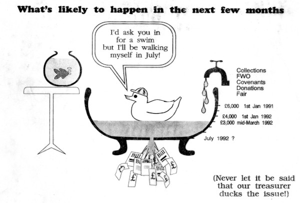
White paper Xerox copy, (295mm x 210mm). A cartoon illustrating the state of church finances in 1992. A combination of 'Letraset' for the headings, 'Letratone' for the shading, typed text and cut-and-pasted content from ealier church publications with hand-drawn additions. Reproduced by photocopying on A4 paper and folded and added as a loose insert to church magazines.
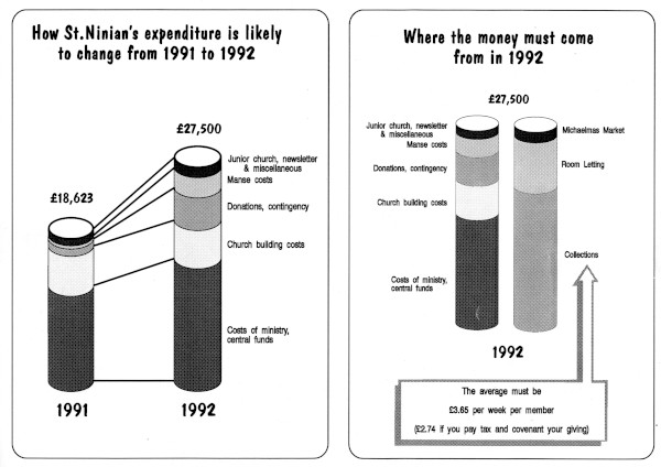
White paper Xerox copy, (295mm x 210mm). Rear of the church finance insert. A combination of 'Letraset' for the headings and body text, 'Letratone' for the shading with hand-drawn additions. Reproduced by photocopying on A4 paper and folded and added as a loose insert to church magazines.
New Tools, Old Dog, No Need
With the arrival of the personal ‘What You See Is What You Get (WYSIWYG) computers ‘anyone’ can become a desktop graphic designer. Drawing tools and text in any font and size can be easily be moved about the page. I am sure if these tools had been available a decade or so earlier my dad would have quickly taken to them.
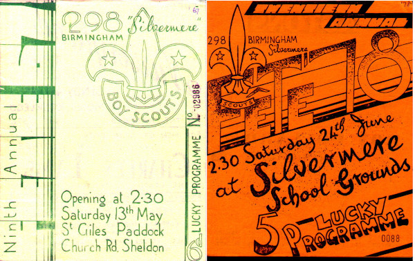
Offset litho on coloured paper, (165mm x 205mm). Scout fête programmes from 1967 and 1978 with hand-drawn artwork and reproduced by offset lithography and hand finished with a self-inking number stamp so that each programme also served as a raffle ticket. Scouts would go door-to-door selling programmes which both alerted people to the event and provided a ready source of revenue to pay off the printing costs. Sales of these programmes far exceeded actual attendance at the event and made a significant contribution to the funds raised by the fête.
By the time they were available he would still have preferred to use ‘Letraset’, he understood that. On the other hand by that time he had retired from work and had relinquished his treasurer posts so he no longer had the need to produce graphics in bulk, the pen and pencil though were still in use up until the end.